GENERAL INTERVIEW
Discussing the value of podcast art with City of Ghosts
Podcasts are an audio-first medium, and for most podcasters the audio is the focus. But if you’ve spent time, money and energy on creating the perfect show, you’ll still need to captivate people with their first sight of your podcast cover.
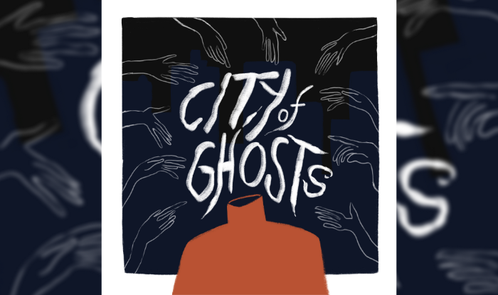
City of Ghosts is a supernatural audio drama that does just that. Set in 1990s NYC, it’s a neo-noir about corruption, murder, and the things that haunt us, and one of the elements that stands out (beyond the quality of the story and the audio) is their beautiful cover art by artist Emilee Graverson. As well as captivating cover art, each episode has its own image, characters are visualised and the scene is set through bonus artwork on their website.
I caught up with Emilee, alongside producer Ryan Patch, and writer Carina Green, to talk about the hidden value of podcast artwork.

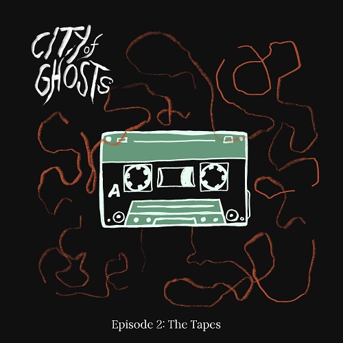
Episode 3: The sisters. The artwork draws on 1990s New York.
Why did you decide it was important to illustrate each episode differently?
Ryan: To be honest, for me it was mostly a marketing decision. The internet and social media, where we knew many listeners would be discovering us, is such a visual medium – even text articles need images. Because we’re a podcast, we don’t have a lot of great visual collateral already – and especially because we recorded in quarantine, we didn’t even have great stills of actors in the studio (they were all zoom frame grabs) and we knew we needed something visual. Having Emilee create more content was a perfect solution to help us with this, and we were blessed with having someone like Emilee who was a font of inspiration and great perspectives who could develop new ways to visualize the themes in each episode.
Emilee Graverson: As a listener, I think it’s really fun to have something visually to look at each new episode. Because of that, I was excited the team wanted to do a new artwork for each episode. It also meant that I got to listen to the entirety of the show, and really immerse myself in the whole plot before working on even the main hero artwork.
Carina Green: Echoing what Ryan said, I think it was a good way to help each episode stand out and provide it with a visual for potential listeners, since social media marketing depends highly on visuals. Emilee did a fantastic job capturing the essence of each episode in a single piece of art.

The 90s aesthetic and technology was a big influence on the artwork.
Emilee, why were you drawn to this project?
EG: I was immediately drawn to the era it took place in. I thought it would be super fun to play around with and draw from technology from the late 90s, and I also love drawing spooky environments and atmospheres. It was a match made in heaven!
Is this first time you’ve done artwork for a podcast? How does it differ to other artwork you’ve done?
EG: It’s my first time doing the main artwork for a podcast! Although I’ve worked with my friends at Lunatics Radio Hour Podcast for many years many doing illustrations and merch. I think podcast art is interesting because it’s kind of a secondary medium, after the more important audio medium. It’s like a fun treat to be able to visualize and see elements of the story as you hear them. Its almost like illustrating for a children’s book or comic, because you have a set script or plot and you get to then riff off of it in your own style.

Mr Orange character card. Each character in the drama was given an illustration.
Ryan and Carina, you both have a strong background in drama/film/theatre before starting a podcast. Do you think that influenced your want for very distinctive visuals?
RP: I wouldn’t actually say that it affected my desire for visuals, but I will say that it certainly helped me listen to my gut more when Emilee came to us with stuff that’s really visually arresting. The show art, for example, is brilliant, and it was one of the first concepts that Emilee brought to us (see concept sketch here). It was weird. But it had something about it that made me stop and say “wow, I don’t know why but this is really impactful.” This wasn’t necessarily the design that made the most SENSE for the show, but it was by far the most ARRESTING design, and years of working in film I think has taught me to listen to my gut in situations like this.
CG: I echo Ryan that I don’t think it really influenced my desire for visuals, but I do think it helped form my idea of the kind of art I really envisioned for the podcast. Part of writing is to paint pictures with words, even for film and theater since you always start with just the words in your script. But for podcasts, especially, you are trying to help someone visualize a world. So as I was writing, I was paying a lot of attention to what kind of atmosphere we wanted to evoke with the show. And I think that’s part of why I felt that Emilee’s art could line up so well for it.

What were your influences for the artwork?
RP: First and foremost, the haunted nature of New York City, of course! I was really excited when we interviewed Emilee to do the art to learn that she lived in the city for several years – this was important for me. The character cards (in this folder) – which I’m really proud of – were influenced by tarot cards, so the Rider-Waite aesthetic I would say figures heavily into what I was hoping to achieve. Also, the bold, solid colors of screenprinting were a bit reference point. However, we hired Emilee for her style, as opposed to having her try to emulate someone else, so I’d say that Emilee is our largest influence!
EG: Style-wise, my illustration work is heavily influenced by screen printing, which is an art form that I love doing! I find that the graphic, limited color palette style of my digital work always stems from my work in that medium! For CoG specifically, though, I was super influenced by my memories of living in NYC, riding the train late at night, and the liminal spaces haunting the city. As Ryan said, tarot snuck in as an influence, which ended up being cool because I have experience illustrating my own tarot deck.
CG: I really love the tarot influence that we all landed on because I think it brings forward the more supernatural aspect of the show. For me, personally, other inspirations and influences came from the NYC I was picturing as I was writing the show, which similar to Emliee was influenced by my time in the city and all the ways it can feel strange and haunted at certain times of night or in certain places. I wanted our art to capture that same feeling of a world that is recognizable as our own, but has a darker, more stylized feel to it and I think Emilee did an amazing job at capturing that.
Were there any images that you wish you were able to use but just couldn’t find a place for?
RP: Yes, there is. This one. Its just so evocative. Since we used this vibe for the cover art and having a large title was very important to us, we lost the opportunity to use the phone in this setup – but I love it so much. It says so much about the character and the era.

Are there any other podcasts whose artwork you really admire?
RP: I love Wolverine, both The Long Night and Lost Trail – how they give you the setting of the show, but keep the characters in silhouette. The redacted visuals of the Homecoming art is simple and effective. Even something as simple as LORE, where its only the handwritten title are great, because simply the typography tells you what you need to know. Cover art is so small, you really need to have it read very simply upfront. What I love about ours is that I think it reads very simply upfront, but has layers as you start at it for longer.
EG: I always think of the original Welcome To Nightvale artwork. I love a limited color palette (as you can see from CoG) and I think it was so cool how the aesthetic from that really led the rest of the show’s aesthetic and color and vibes. It was also the first time I’d seen something illustrative for podcast artwork.
CG: I really love the artwork of The Black Tapes, which I think is simple but incredibly evocative with its muted colors except for the red of the protagonist’s jacket. Similarly, the artwork of Old Gods of Appalachia is really arresting and has many layers to it the longer you look at it.
Where can readers find more of your work?/Where can readers find out more about you all?
RP: People can read more about me at ryanpatch.me, or follow me at @ryanpatch in IG and @d_ryan_patch on twitter. Don’t forget to follow @cityofghostspod on twitter and @cityofghostspodcast on IG as well!
EG: I am on Instagram @emileehere and my original tarot deck that I illustrated can be found at: personalspacepress.com, along with more of my artwork.
CB: I’m working at having more of an internet presence but folks are welcome to follow me on twitter @cagreenwrites. I’m also writing an online novel for Tapas Media, Return of the Keeper, which will be launching on the 21st of March, so you’ll be able to find me on their website, tapas.io, as well.
Listen to City of Ghosts on Apple Podcasts, Spotify, and other podcast players.


